Finishing works
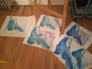
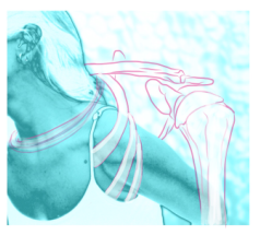
Shoulder Replacement ProcessAbove are process shots of the Shoulder Replacement piece in progress. I have drawn the shoulder anatomy on tracing paper, overlay-ed it onto the larger sized cobalt blue version, and began using a mix of Inktense pencils and acrylic paint. I really liked how in the practice version, the rings around my neck stood out against my skin. I am trying to lightly work on the rib cage that wraps around my arm to get the same effect. I also cut out the large scale version and am realizing I will need to go back into it to adjust colors. I did finally test out how it would feel to glue it together on the small version, using ModPodge (because I had it on hand). I actually liked how it was flexible to a point. If I didn't let it dry for too long, I was able to pick it up and rearrange it. The bone folder was the perfect tool to remove air bubbles and wrinkles. Once it dried, I ended up not liking it for some reason. I traced and cut out the shoulder anatomy once again and glued it over the first version, in an attempt to soften it. I still don't like it. Trying to find a solution, I began to lay out all the print versions I have and am playing with all sorts of solutions. One of my new favorites is a contour sketch of the shoulder anatomy and dramatic paint layers. Since it is on an 11x17" practice paper, I may as well assemble it just to see how it will look. I wanted this piece to be done for critique, but I don't think it will be at this point. (Studio Time 6H) Foot X-Rays
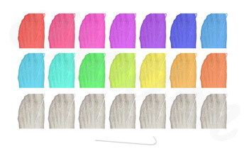
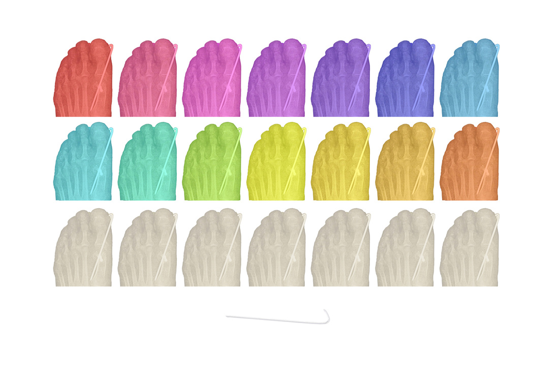
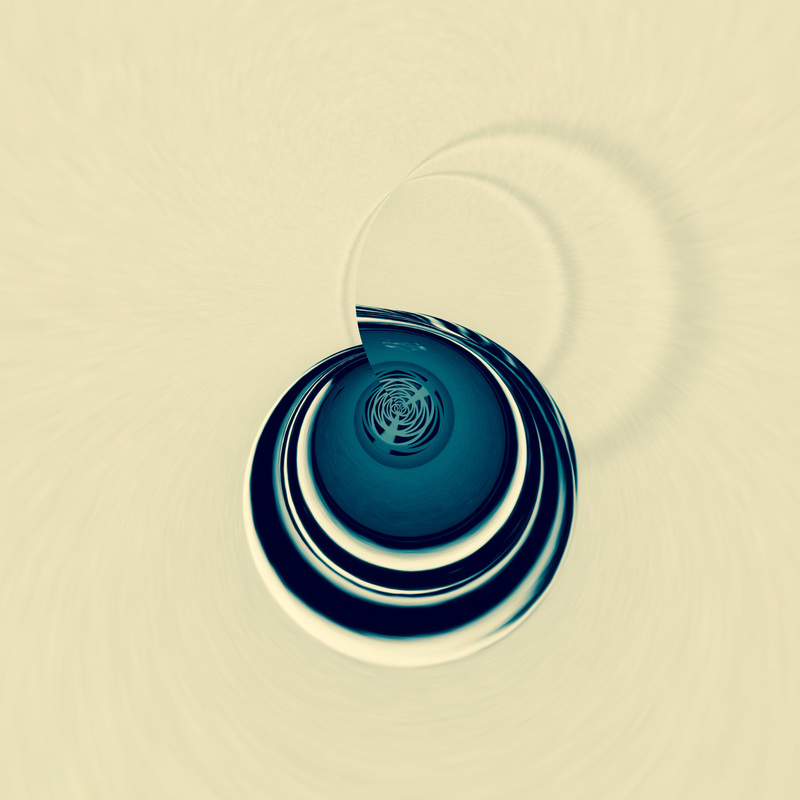
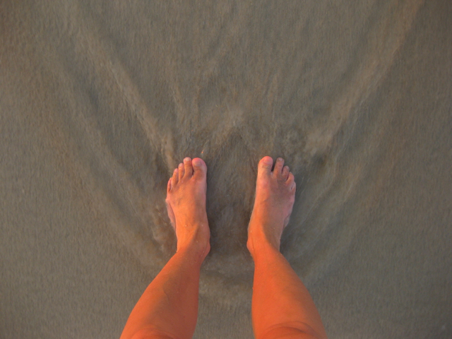
I went back to this one final time to experiment with how it would look with more of my toes visible. The image on the right has my full toes visible, while the image to the left has my toes cropped. I prefer the toes cropped because I feel it makes it less obvious that it is my foot x-ray. Many people have assumed it was some kind of shell at first site, and then realize it's actually a foot x-ray upon closer examination. The image with my toes clearly makes it look like a foot x-ray. So even though I took the time to make it, I still prefer the cropped version, which means I can now investigate getting it printed larger and on a good quality paper. (3H to rebuild one last time, with alternate versions) Foot X-Rays Final VersionsNew experimentsWorking with my advanced group, I challenged myself to create a piece solely on the iPad. I used several iPad apps (Photoshop Express, Adobe Draw, and Brushes) to achieve the end result. I would call this a digital collage, considering it is made up of my photograph, a digital painting, and an edited skeleton image. I have started a unit that applies what I am learning in this Graduate course to my Advanced Art group (a mix of juniors and seniors in high school). The objective is to mix studio and digital methods, employing the use of iPhones and iPads as the primary art making tools. Because the students are all exploring diverse concepts in their work, the main objective is focused on the use of inventive medium. What I have discovered is PicsArt app (even the free version) is amazingly similar to Photoshop. While I have not fully explored it, I have started to play with it more. I love that some of the powerful features Photoshop offers have been recreated on a portable device, like the iPad. Another amazing app that is giving me ideas for future artworks is Roll World (also free). It's primary purpose is to make Tiny Planets (which I teach my digital art students how to do in Photoshop), but I am using Roll World unconventionally to create abstract or non-objective compositions. I can see possibly printing out dozens of these and collaging them. This may be where I can use my artist inspiration of Michael Mapes. I love how he creates images out of smaller objects and images. I might use Roll World to create the small images that will make up the larger whole image. (iPadology 2H) Ideas for Future works
0 Comments
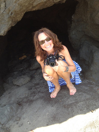
Planning & CreatingAfter working many hours on the Typographic Self-Portrait, I had another idea for incorporating type into an artwork. My husband took an image of me crouching in the entrance to a small beach cave on Martha's Vineyard island. Seconds after he took the photo (in the time it took him to look back at the image on his phone screen), the upper portion of the cave broke off and fell on me, as I was in the process of standing up. The impact coupled with the fact that all of my weight was on my left foot as I was getting up, snapped my big toe and second toe, breaking the bones at the metatarsal joints. I also fractured by right elbow when I braced myself during the fall. Below are ideas I have for this image.
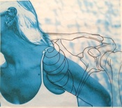
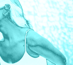
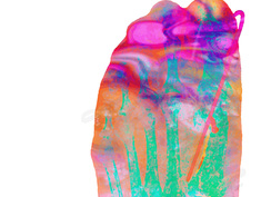
Shoulder ReplacementI was initially very excited to work on this, after printing a test image and falling in love with the intense cobalt blue ink. However, when I went to get it professionally printed, the ink was a calmer faded turquoise, which is workable, but not as striking as the test image. I am now testing out how I want to add the shoulder anatomy into the image. I definitely want the ribcage wrapped around the arm, and possible in strands around the neck. However, I am having second thoughts about how to bring the shoulder in. I tried using Derwent's Inktensese pencils on tracing paper, but was unhappy with the quality of the tracing paper. I do like the idea of collaging the shoulder anatomy in, but will try a thicker paper. The tissue was wrinkling. I am also going to experiment with permanent marker on acetate for the shoulder. (3H) I ended up getting it reprinted and adjusted the color so I could have the original blue I liked so much. I also finished the tissue paper version, and while I am happy with how it came out, I am now also experimenting on a piece of vellum, because it will lay flatter. However, the inktense pencils don't do so well on the vellum, so I have been using more paint. I also tried getting this image printed larger, but the prints won't be ready until next week. Ultimately, I would like to use the larger version as my final version. (3H) Artist Inspiration (Gerard Richter)I have an artist crush on Gerard Richter. I love how he takes a photograph and masterfully smears paint over it, leaving elements revealed (Overpainted Photographs series). The juxtaposition of the abstract marks with paint, over the realistic image in the photograph merge two of my favorite mediums (photography and painting). Not that I am anywhere near Gerard Richter in terms of talent and success, but I would like to think I have a knack for expressive color use in Photoshop. Not wanting to completely copy Richter, I edited some of my photographs with the intent to play with them in the studio, mixing paint onto them. I might also print some on acetate, to again, try something I haven't seen Richter do (yet).
Also, with some of my images having intense color, I think I will play with monochromatic colors or grayscale paints. Time spent finding images to play with and photoshopping (1 H). Actually practicing "Richter-style" paint over the photographs (1H). It was horrible and did not work well. Planning & Creating (2/7/16) Needing a break from the Foot X-Ray image, I am starting to think about the suggestion of drawing into my own photographs. Still going with my "perseverance" series, Oh, By the Way..., I am thinking of using a photograph of myself, focused on my left shoulder, which has been replaced. I started researching artists who draw on photographs and found Alana Dee Haynes. She is young and her style certainly is all about drawing repetitive patterns on top of mostly fashion editorials. In her personal collection, she has a series in which she also added in paint over the figures and patterns, which I am very much drawn to as an idea for mixed media and collage. The struggle for me will be to find a photo of myself worth using. I hate being in front of the camera and much prefer to be behind it taking the shots. This means I will start by digging through my existing photographs to see if I have something useable, and will only shoot new images if I can't find what I am envisioning. I would also like to try both drawing on actual printed photographs and also drawing over photographs on my iPad. Ideas for working with Photographs
Feedback from Critique I received much needed feedback on my work at Wednesday's critique session (2/10/16, 1H). For me, and many other artists, making work in a vacuum can be confusing and frustrating, so having a group to view your work and provide commentary is extremely helpful. What I am finding is I have some solid skills in Photoshop and there is great potential to print the works and apply studio methods over them. I am most excited about my practice sketch with the turquoise self-portrait image, in which I started to sketch the shoulder anatomy in the negative space and also interacting with my arm. I am getting this printed on a fiber-like paper in a larger scale, so I can draw and paint into it. The other pieces just need small tweaks, while the chaotic watercolor foot x-ray piece is completed. Revisions
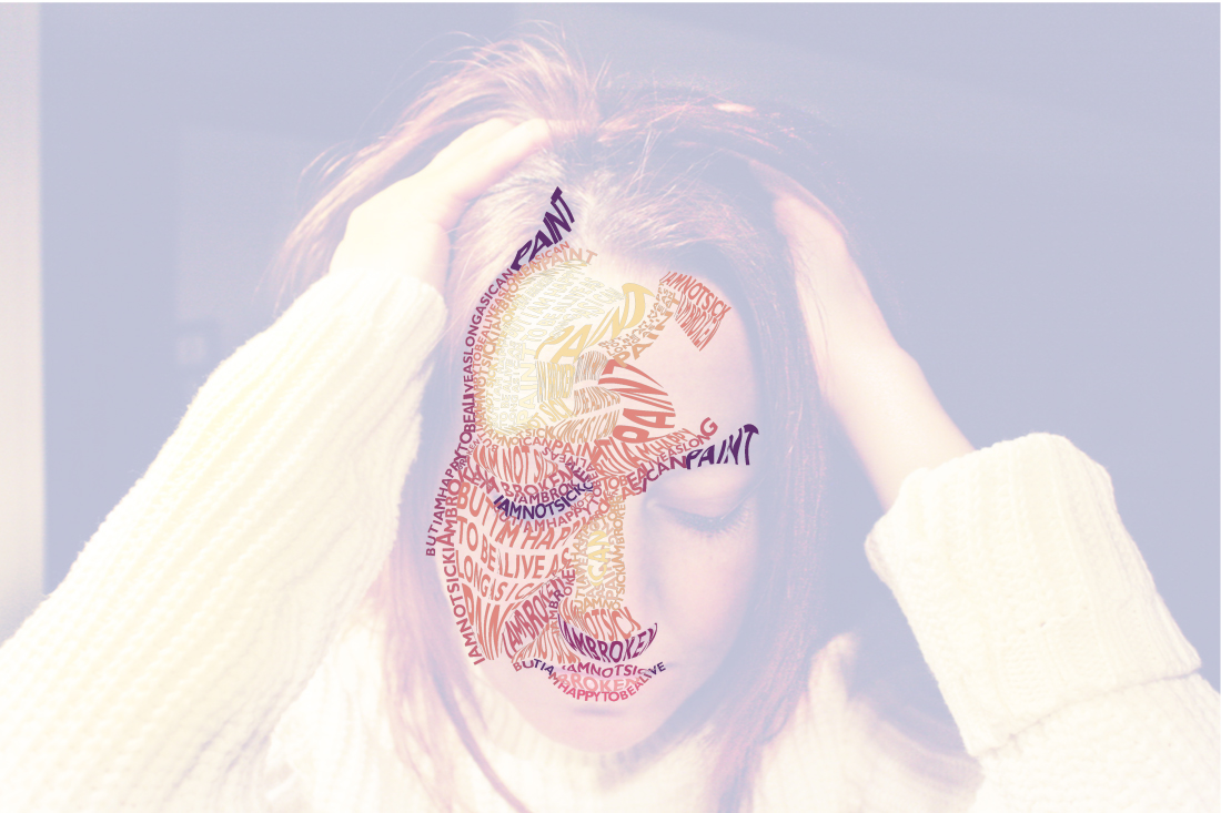
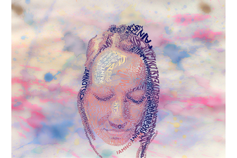
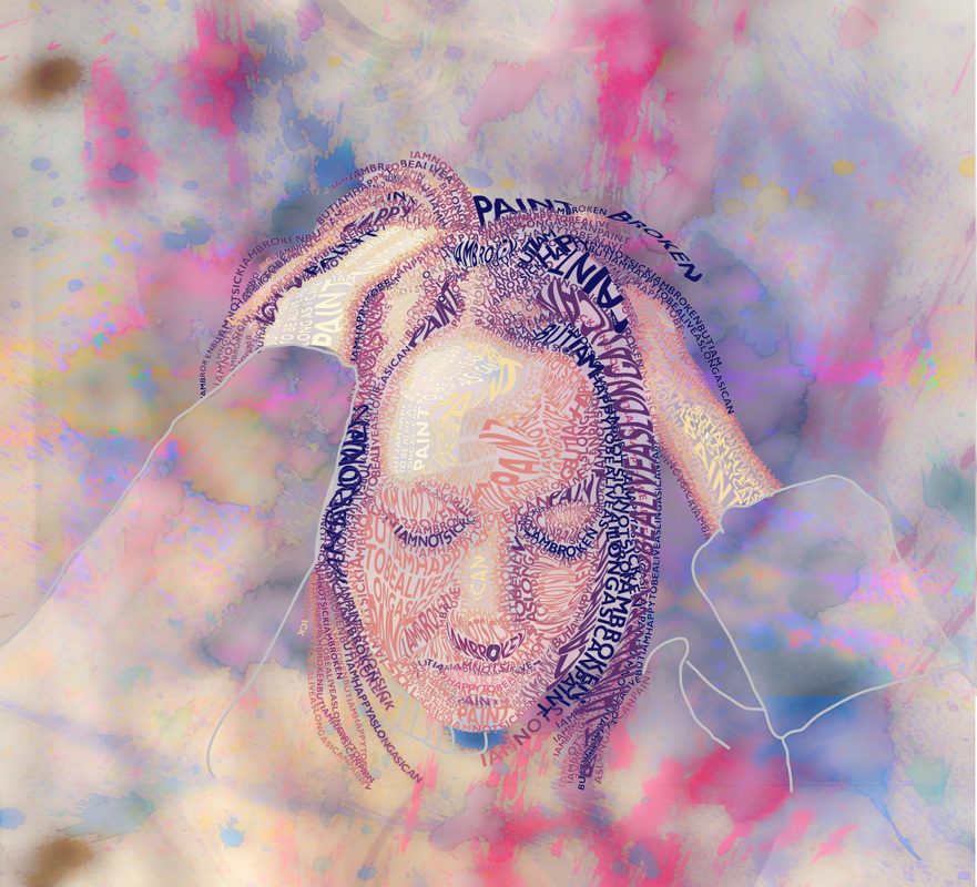
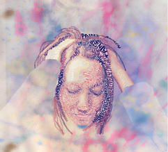
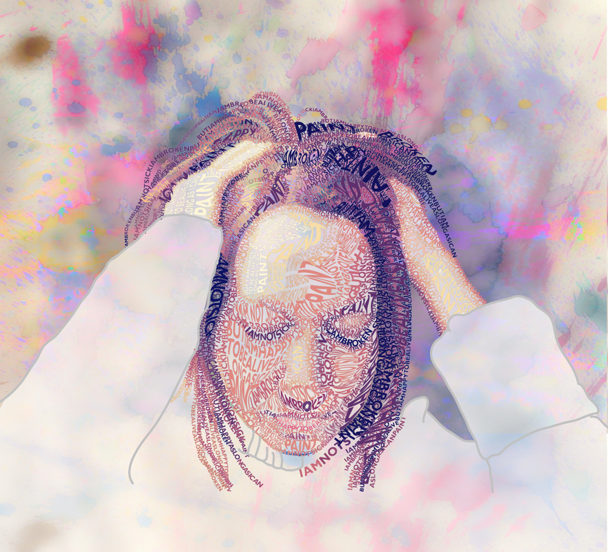
New Projects I am working on a Typographic Self-Portrait relevant to my Oh, By the Way... series. I shot and selected a photograph of myself in which I appear stressed or in pain. Originally, I was working on it in class alongside my students, and was using words and phrases that represented things in life that keep me sane and stress free. However, I was not satisfied with it and restarted it after 3 weeks with a stronger message (see original version here). I am trying to use mostly Envelope Distort for the text, tracing a shape from my face and filling it with text. The quote I am using repeatedly is "I am not sick. I am broken. But I am happy to be alive as long as I can paint." The quote is from Frida Kahlo, who has been my number one inspiration from the early 90s to current day. I plan to finish it, and possibly print it on acetate so I can layer it over a painting. I am also going to play with it digitally, converting it to a GIF file so I can lay it over Photoshop paintings.
Some ideas I have to bring this beyond just a Typographic Self-Portrait with a Photoshop background are to print it on several surfaces, break them up, and reassemble them.
Work-in-Progress Experiments
Creating After the critique on Friday, I have some new ideas to move forward with. Instead of the X-Ray foot color wheel, I am trying more of a digital collage, which I thought I could whip up in a matter of minutes, but here it is 2 hours later and I am still working at it. It's not so much that I don't have the skill to make a digital collage, rather, I am not sure which variation I like. I would also like to get these printed on a larger scale and play with working into them by hand. I may try that first on an 11x17" size to experiment on, before investing in a 24x36" print. (2/1/16 - 2H 30M) I worked another night on some experimental pieces. I first tried to figure out how I made these glue collages using white glue, liquid watercolor, and acetate. I tried it 3 different ways: glue on paper first, glue on acetate first, and glue on half of the acetate then fold it. All three are drying and I won't know how they turn out until tomorrow. I also played with the Duralar paper, sketching onto it with inktense pencils, and rubbing a damp cotton swab into the pencil to smudge it. I also tried a wet-on-wet watercolor wash on the Duralar paper and am unsure of how it will dry. I am concerned the paint might chip off. Lastly, I retried the digital collage of my foot again, this time simplifying how many I included and ending with a bottom row of washed out white xrays. I think it is my favorite so far, but will need to redo it, considering I did not take as much time and care with the selection tool for a smooth cut out. (2/2/16 - 3H) (2/5/16) Tonight I cleaned up my colorful Foot X-Ray digital collage. I am actually ready to get it printed large scale! I also played with layering a photograph of the watercolored Duralar paper experiment with the same foot x-ray and might also get it printed to see how it looks. (1H 30M) (2/7/16) I fixed up the experimental piece with two of my foot X-rays on acetate overlayed onto the watercolored Duralar paper. I outlined some of the bones and played with adding black and white to help the structure of the bones stand out over the busy backdrop. I'm not sure how I feel about the piece and am currently trying to save another Duralar experiment (the one I drew onto with inktense pencils). When I packed it, the other Duralar piece leaked onto it and now it has smeared color on the back of it. I stopped momentarily to go back to research and reading and stumbled upon this article from Smithsonian.com, called X-Ray Art: A Deeper Look at Everyday Objects. I dug around the internet looking for more information on Hugh Turvey, and found his Xogram Handshake 2006 to be most inspiring to my current works. The bones are in soft shades of jewel tones and the background is a crisp white. Symbolically, it is a little too obvious for my taste, but I am sure it is a wildly popular image since it is a classic pose. The composition of the tennis shoes that have been x-rayed together reminds me of lungs, which makes me think of the connection between exercise and health. This is more where I would like to go in terms of subtle interpretation. Overall, I am drawn to Turvey's images because of his color choices and compositions. Many of his pieces have vibrant colors and unusual objects. Yet, the simple placement on the page makes you examine the object more closely and think about that object's purpose in our world. Graphically, they are strong, yet simple placements. This also connects back to the feedback from the first critique, in which it was suggested I keep the brightly colored foot x-ray piece on a crisp white background. When I showed it to my husband, he said, "It looks like rainbow colored shells." I was actually happy to hear that since I am trying to disguise the disturbing images behind aesthetically pleasing colors and compositions. (3 H) Finished Works |